Introduction.
Spookomi spent years earning a devoted following, all without any advertising. They asked Scellus to design, build, and ship a new e-commerce site.
With both of our team working together, we created an immersive digital store front inspired by their original in-store experience. This approach makes the site feel like a natural extension of the brand.
Work summary.
Country
Malaysia
People involved
16
Duration
24 weeks.
Scope and tech
Ecommerce Website Design & Development
Industry
Ecommerce, Retail
What we did.
- Digital product strategy.
- End-to-end e-commerce redesign.
- Front-end development and quality assurance.
- Photography direction and writing guidelines.
- Training for Spookomi designers and developers during handoff.
Business cards.
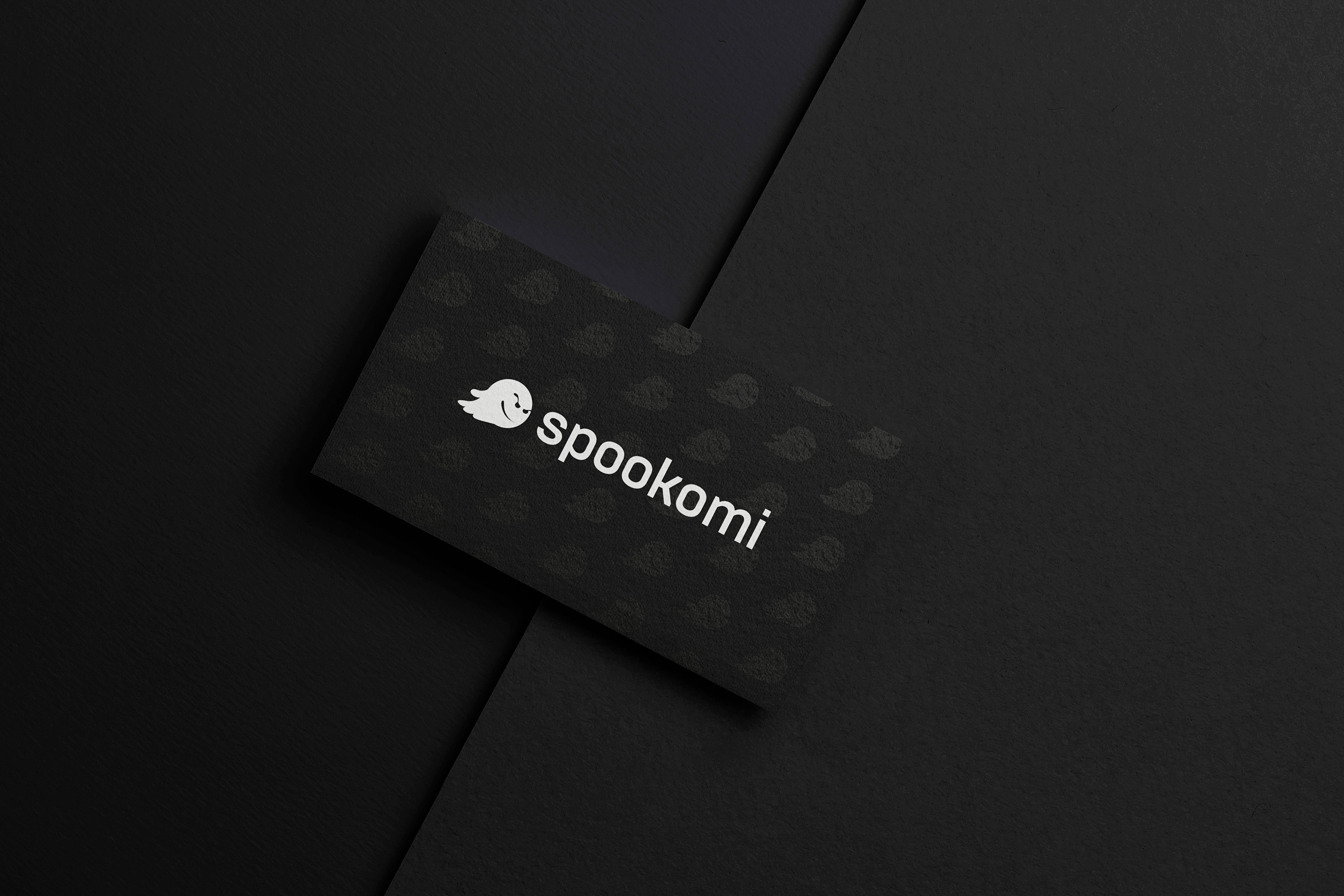
We chose Raised Spot UV to show the three dimensional nature of the artwork. We love the matte finish on Spookomi’s cards, and everyone is impressed by the quality and the design.
Highlights.
2
Weeks from kickoff to initial deployment.
31%
Higher conversion within 60 days of launching.
Features.
Currency selector.
Scellus implemented a dynamic search functionality that is central to the buying experience. This gives users the opportunity to search for a key word, color or a product, on the go.
Their customers are able to filter what they are looking for while also discovering new products within the search parameters.
The search functionality also connects to the database in real-time, filtering and displaying products as the user is typing.
Like this project?
Your success story could be next. Our experts are ready to bring your vision to life.
